Mastering CorelDraw Color Harmony
Discover the importance of Color Harmony in CorelDraw Graphic Design Software. Learn how to create visually appealing compositions using complementary, analogous, and monochromatic palettes. Explore tools that enhance balance and consistency in your designs.
CORELDRAW TUTORIAL
3 min read
Understanding Color Harmony in CorelDraw
Color harmony refers to the pleasing arrangement of colors that results in a visually appealing composition. Get_CorelDraw_Online (Nothing to Download or install. You simply need a Browser and Internet to start working on CorelDraw). Mastering color harmony is essential for graphic Artists and Designers, who wish to create cohesive and striking designs. Understanding color harmony in CorelDraw helps designers create visually appealing compositions. The CorelDraw software offers tools to explore different color schemes, ensuring balance and consistency. Using complementary, analogous, or monochromatic palettes enhances design impact while maintaining harmony. CorelDraw Color Harmonies feature allows users to adjust related colors together, making modifications easier while preserving cohesion. By leveraging the color wheel and harmony rules, users can craft designs that evoke emotions and communicate effectively. Whether designing logos, advertisements, or illustrations, mastering color harmony in CorelDraw ensures professional and aesthetically pleasing results.
Principles of Color Harmony in CorelDraw
Color harmony in CorelDraw designs, is all about creating visually pleasing and balanced color combinations. It ensures that colors work well together to evoke the desired mood or aesthetic. Here are the key principles:
Complementary Colors – In Color Harmony, these are colors opposite each other on the color wheel, like blue and orange or red and green. They create high contrast and vibrant compositions.
Analogous Colors – In Color Harmony, these are colors next to each other on the wheel, like blue, blue-green, and green. They provide a more harmonious and subtle visual effect.
Triadic Colors – Three colors evenly spaced around the color wheel, such as red, yellow, and blue. In Color Harmony, this creates balance while maintaining contrast.
Split-Complementary Colors – This scheme in Color Harmony uses a base color and the two colors adjacent to its complement. It offers a strong visual contrast but is less intense than direct complements.
Monochromatic Colors – Variations of a single color (like different shades and tints of blue) create a clean, cohesive look in Color Harmony designs.
Tetradic Colors (Double-Complementary) – This is Four colors arranged into two complementary pairs in Color Harmony. This creates rich color diversity but requires careful balance.
Warm & Cool Colors – It is understood that in Color Harmony, Warm colors (reds, oranges, yellows) create energy, while Cool colors (blues, greens, purples) evoke calmness.
Using these principles of Color Harmony strategically, helps designers convey emotions, establish brand identities, and enhance readability in visual compositions. Would you like an example of how to apply these in a design?
Changing Color Harmony in CorelDraw
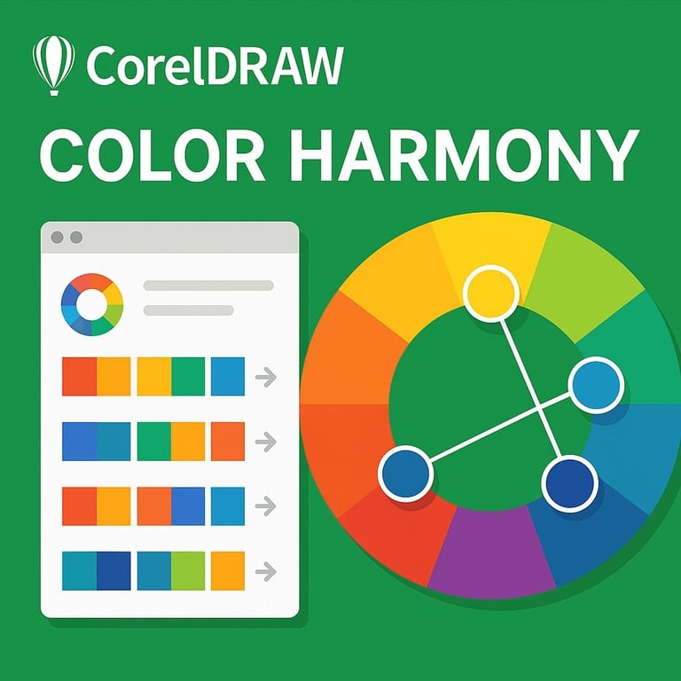
To change color harmony in CorelDraw, users can utilize various tools and features available within the suite. Begin by selecting the colors within your design. CorelDraw offers a color palette and several color harmonies, such as complementary, analogous, and triadic schemes. By accessing the color harmony feature in the color docker or utilizing the Color Harmony palette, you can experiment with different combinations that best suit your project. This flexibility allows you to shift colors smoothly while maintaining a harmonious aesthetic.
Advantages of Color Harmony in Design
The colors in the color harmony can be changed by just rotating the handles in color harmony wheel in CorelDraw_Graphics_Suite. The advantages of employing color harmony in your designs are multifaceted. First and foremost, it significantly reduces the workload of an artist. By guiding their color choices toward established color relationships, artists can streamline the creative process, thus saving time and effort. Additionally, designs that adhere to color harmony are more likely to catch viewers' attention, leading to enhanced engagement and aesthetic appreciation. Moreover, utilizing harmonious colors can help evoke specific emotions and moods within the artwork, further enhancing the effectiveness of the visual communication. This aspect is particularly crucial in marketing and branding, where colors can significantly influence consumer behavior.
Tips for Achieving the Best Color Harmony in CorelDraw
To achieve the best color harmony in CorelDraw, consider these practical tips:
Utilize the Color Harmony Tool: Experiment with different color schemes and visualize how they interact with each other.
Leverage Color Palettes: Save favorite combinations as custom color palettes for future projects to maintain consistency.
Pay Attention to Contrast: Ensure your designs have sufficient contrast to enhance readability and visual interest.
Seek Inspiration: Explore design websites and nature photography to discover harmonious color combinations that resonate with you.
By implementing these strategies and understanding the principles of color harmony, you'll not only improve your design skills but also enhance the effectiveness and appeal of your creative projects within CorelDraw.
Practical Examples of Color Harmony in CorelDraw
Did you know that CorelDraw_Online offers powerful tools for applying color harmony in design? Here are some practical examples:
Logo Design – When creating a brand logo, using complementary or analogous colors ensures a visually appealing and balanced look. CorelDraw Color Harmonies feature allows designers to tweak colors while maintaining harmony.
Marketing Materials – Flyers and brochures benefit from triadic or split-complementary color schemes to create contrast while keeping your CorelDraw Online design cohesive.
Illustrations & Artwork – Artists can use monochromatic color schemes to create depth and mood in digital illustrations in CorelDraw Online.
You can explore more details in this CorelDraw Tutorial Video on Color Harmony.
